London UK
PHOTOBOOK HISTORIES
YEAR: 2022 COMPANY: PHOTOBOOK HISTORIES PROJECT TYPE: EDITORIAL DESIGN, SOCIAL ROLE: GRAPHIC DESIGNER
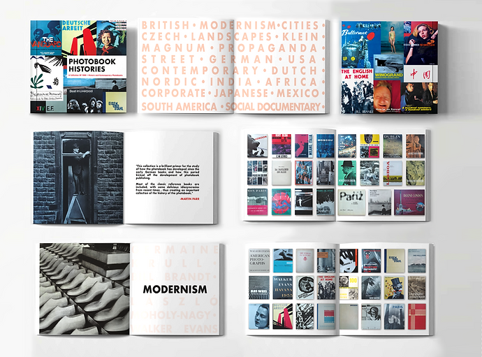
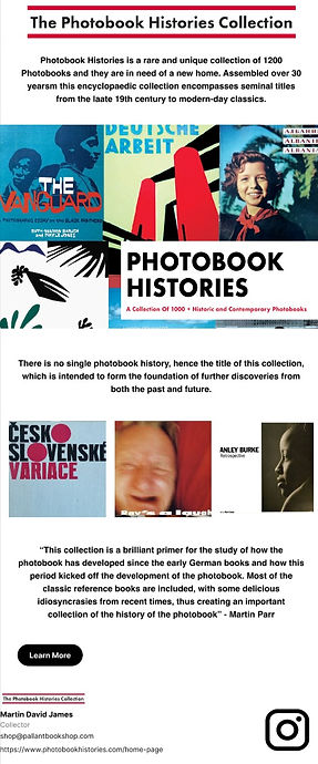
This catalogue shows a collection of a client's photography book collection which is intended to be sent out to galleries, collectors or institutions that are looking to buy the collection. The client also hosted a talk at the Royal Photographic Society recently and wanted to display the booklet and website during his presentation. I was in charge of the layout of the catalogue and preparing it for print. I also created an email marketing campaign, social media graphics and a website, which had over 300 hits in the first day of launch. The catalogue also sold out on the Pallant Gallery website.
KEY ELEMENTS
This project's brand identity was taken from elements of photography book covers that are displayed on the front of the brochure. I took the red, white and black from the front cover and applied that across the branding, this is a colour palette that draws your attention instantly, its energetic and modern. The title on the book's cover also looks similar to old London street signs, which is a nice homage to the author, who established his photography career in London.


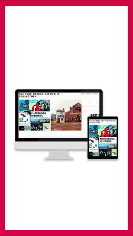
WEBSITE AND DIGITAL
The most important aspect of the website was that it is simple to navigate, clear and easy to read and that the contact details to my client were clearly displayed. The websitte has a PDF copy of the brochure, additional information about the collection and a contact page/social link to the client's page. When the website was launched I created a promotional email alongside, to guide potential buyers to the site and give a few snippets to what's inside the collection.


SOCIAL
These videos were inspired by reels on instagram from brands that have a similar demographic, such as Taschen and manhattanrarebooks.
DIGNITY FOR CHILDREN & YOUNG PEOPLE
YEAR: 2022 COMPANY: DIGNITY PROJECT TYPE: WEB, LOGO DESIGN ROLE: ASSISTANT GRAPHIC DESIGNER
Dignity for Children and Young People is a one stop, holistic approach that celebrates the fact that Dignity is in the forefront of all of our lives as Children and Young People, adults who work with them, parents and carers, grandparents, employer’s, youth groups and club leaders and all that interact with children and young people in their daily life or work. It was my responsibility to come up with a fun and friendly mascot and logo to represent the tone of voice of the charity. I also created a web banner and animation to market the charity online.
KEY ELEMENTS
The client had a mascot in mind with this project, but it needed some refining and a few changes. Brand mascots help your audience engage with your cause in a fun and unforgettable way and enables your charity a recognisable face. As this is a children's charity it felt suitable to have a cute, friendly looking mascot that had a playful and childlike quality to it. The reason behind the hand in the Dignity logo was to represent the '5 a day challenge' that the charity has set up, but it is also a universal sign for greeting, openness, friendship, hospitality, or generosity.


While a digital banner is great for paid advertising such as google ads, a animated video works really well on youtube, websites and linkedIn, with a call to action at the end to send the viewers in the right direction. Its short and simple, getting all the necessary information to viewers in under 10 seconds.
ANIMATION
CLINICAL DIGITAL INNOVATORS - NHS
YEAR: 2022 COMPANY: AHSN PROJECT TYPE: VIDEO, SOCIAL ROLE: VIDEO EDITOR
Sussex Community NHS Foundation Trust (SCFT) tweeting as @nhs_scft provides a range of different services throughout a wide area of Sussex both out in the community and in dedicated clinical areas. In total, SCFT has nearly 6,000 members of staff working across West Sussex. I assisted in video editing, sound recording, motion graphics and creating social media assets to market the event on the @WeNurses twitter takeover.
KEY ELEMENTS
Sussex NHS provided us with a list of brand guidelines which I implemented throughout the designs so that it matched the rest of the materials on their socials and website. It was important to display all of the relevant information on screen such as the NHS Sussex logo, the name of the interviewee and their role within the community.


While I was in charge of doing the digital design for this project, I also attended the video shoot and helped out with sound and filming. I also cut together the final interview for the twitter campaign, adding simple yet effective motion graphics of the nurses's title, job position and the logo for the Sussex community.
The videos totalled 5000 views with a lot of engagement through commenting and liking. We also encouraged those in the nursing community to repost the videos on to their personal twitter accounts to increase engagement.

VIDEO EDITING
ECE UNILEVER
YEAR: 2021 COMPANY: UNILEVER PROJECT TYPE: LOGO DESIGN ROLE: GRAPHIC DESIGNER
These logos were commissioned by Unilever's global marketing department to help train and inspire the branding and marketing teams across the company. Each colour was part of the official company colour palettes. Enabling creative excellence was more commonly known across the company as ECE which is why those letters are specifically bold. They wanted the yellow shape to communicate a flash of brilliance.
KEY ELEMENTS
Unilever provided me with the brand guide lines so that i could ensure that my final designs were consistent to their other marketing materials. We went through different colour palletees, the first using white, purple and green, but with some more experimentation I landed on the yellow, red and blue as they contrasted each other well. I also went through lots of different shapes and patterns, but landed on the final one as it represented a 'flash of brilliance.'


