London UK
CITY UNSCRIPTED
YEAR: 2023 COMPANY: CITY UNSCRIPTED PROJECT TYPE: GRAPHIC DESIGN, BRAND IDENTITY ROLE: GRAPHIC DESIGNER
City Unscripted is a private and personalised tour service that is tailored to the customer's wishes and preferences. This campaign pitch 'Discover Your _' empowers the customers to find areas of a city that often get ignored or overlooked, not just what tourist landmarks. City Unscripted pairs customers up with a local guide, who will ensure that they provide a local insight to the trip and show you places that you may not have discovered otherwise. So many holiday goers feel pressured to go to all of the tourist sights and over rated places that come on top on trip advisor, but this campaign goes against that, and encourages the customer to own their trip and do what they want to do.
KEY ELEMENTS
The Photos, which were taken on my trip to Paris, depict the rawness and realness of the city, not just set up glamorous shots that you see online. The idea is that these are the snapshots of life you see when you take a walk around the city as if you were a local. The photos allow holiday goers to see a city through the eye of a local, and that beauty lies in all corners of the city, not just the tourist landmarks. The colours and typeface reflect the brand's guidelines on their website.


DIGITAL
Digital ads will be displayed on electronic billboards and bus stops that are fun, loud and moving to grab people's attention. In the same style as the physical ads, Instagram and social adverts will also encourage holiday goers to own their holiday experience, or get in touch with a local through the companies website.

LA VIGNE
YEAR: 2021 COMPANY: LA VIGNE PROJECT TYPE: GRAPHIC DESIGN, BRAND IDENTITY ROLE: GRAPHIC DESIGNER
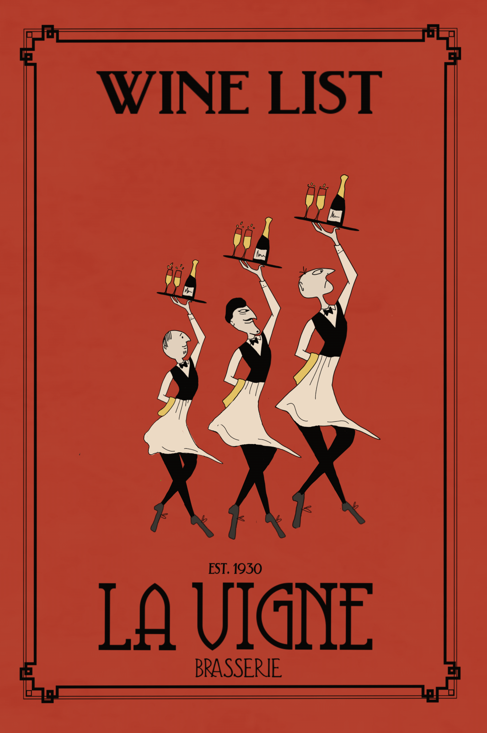
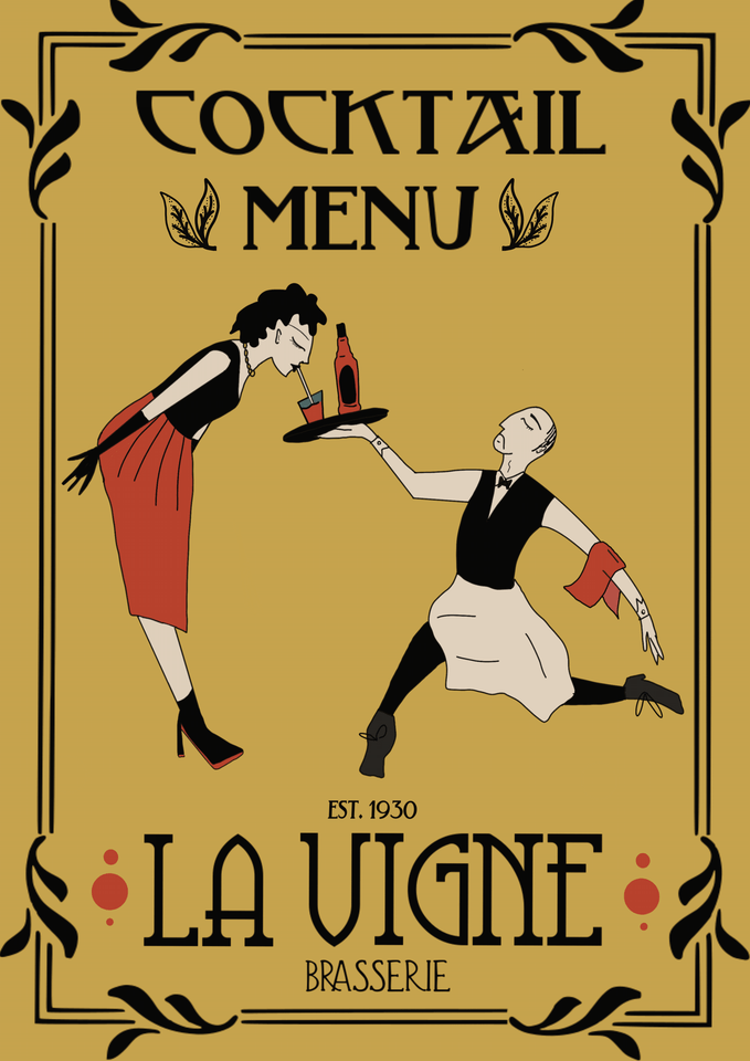
This collection of graphics is for a rebrand of a Parisian restaurant called ‘La Vigne’. The family run business wanted the new branding to reflect the quirky and light hearted experience that the restaurant will provide. The owners wanted the customer to 'travel back in time' when entering the restaurant and experience a Parisian restaurant straight from the early 1900s. The Art Nouveau font and boarder reflects the popularity of the movement featuring in cafes and bars in 1900s Paris, with Forbes saying that the movement will making a come back in 2023. The vintage style is humorous yet classy, appealing to a wide array of customers.
KEY ELEMENTS


In order to stand out from rest of the competition I went for a very specific look with historical elements. Having elements of Art Nouveau makes the restaurant's branding timeless, chic and a great reflection of the sophistication of this restaurants. The branding's identity will be reflected in the interior of the restaurant, so can act as a escapism, a time capsule in this hectic modern world.


ANIMATION
FOR SOCIALS
Video content on social media is increasingly gaining popularity, especially animated and motion graphic videos. According to LinkedIn, a video can help you get 38% more reach than an image, so for the growth's sake of a business, animation should be implemented more.
Videos such as these are simple yet eye catching, so are prefect for an instagram story, an app or website landing page.
As I was in charge of the overall rebrand, turning to social media was a good place to start to show off the restaurant's personality. Having interactive animations where the viewer can swipe up to find out more about the restaurant is a good way of driving traffic to the website.

WEBSITE
Tasked with re-branding the website, the illustrations and type face are featured on the landing page and allow customer's to know they are immediately in the right place.
The website is simple, easy to navigate with a simple navigation menu and a short description of the restaurant so customers know what they will expect.
NICE FACE COSMETICS
YEAR: 2022 COMPANY: NICE FACE COSMETICS PROJECT TYPE: GRAPHIC DESIGN, BRAND IDENTITY ROLE: GRAPHIC DESIGNER
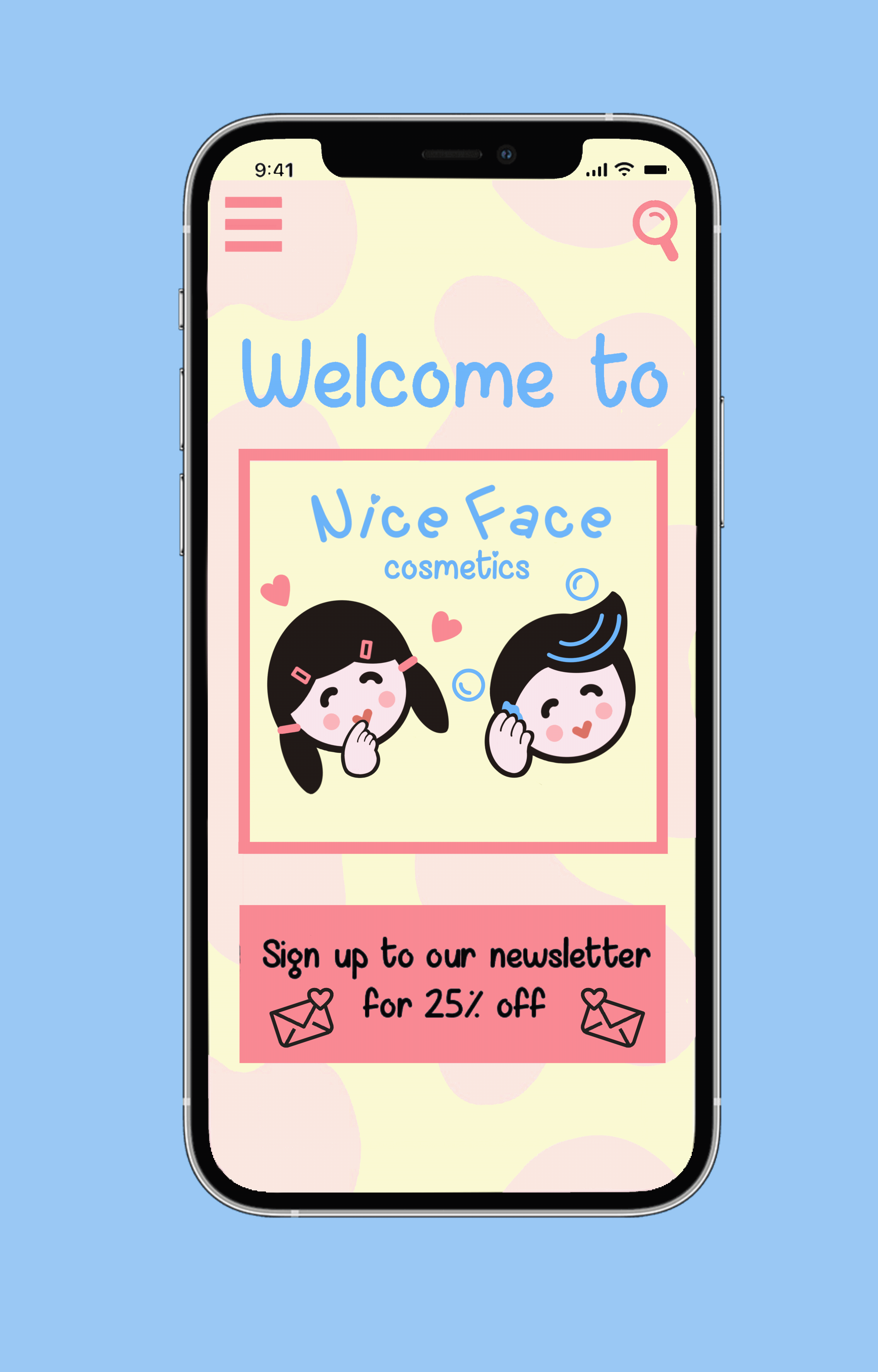
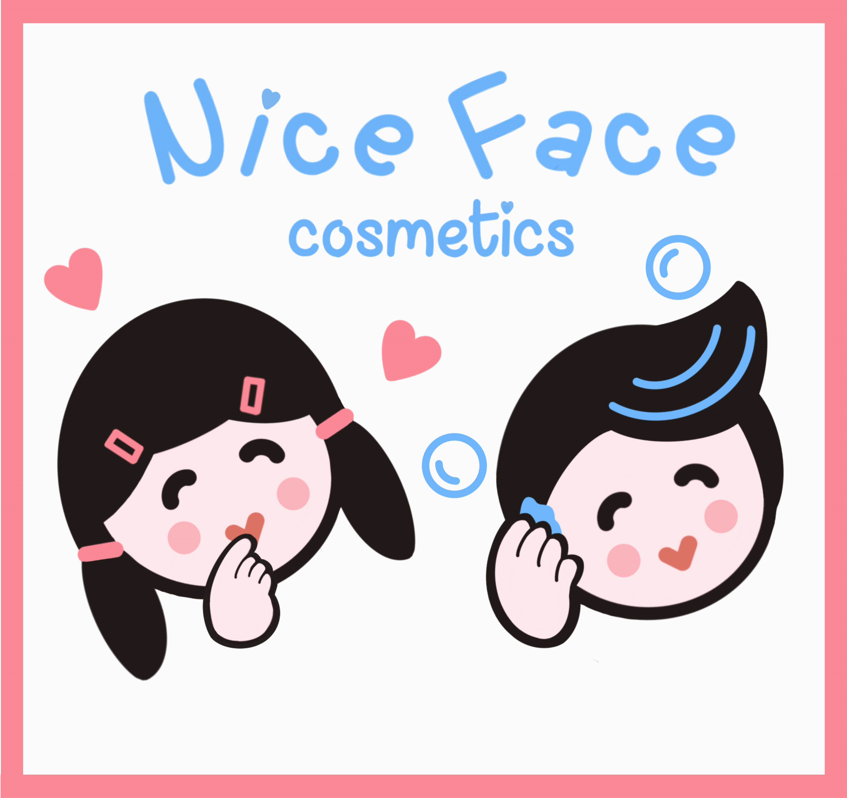
A product packaging project to promote a new line of makeup and hair cosmetics to the UK. The task was to come up with a fresh brand identity and new product line that is youthful and cute to appeal to a teenage/young adult demographic. The banding is inspired by Korean and Japanese cosmetics which have been become increasingly popular in the UK in recent years. Animal mascots and cute characters are featured on countless cosmetics in Korea and Japan.
KEY ELEMENTS
Nice Face Cosmetic's target demographic are young adults and teenagers and unisex. The colours are diverse, i tried to ensure that they didn't just cater for a female audience. Nice Face Cosmetic’s mascots can become so synonymous with the brand that they recognised on their own without the need for an accompanying text logo, but the playful type face is memorable also.


SOCIAL MEDIA
CAMPAIGN
Instagram stories get some of the highest engagement, so are fantastic for creating sales and traffic to a small business's website.
Ensuring the brand guidelines are consistent across all social posts makes the pages look trust worthy, make your business standards high and makes your products recognisable.
Focusing content that drives sales is important which is why I have used keywords such as 'discounts' and '50% off.' But also using 'You' and 'We' makes the tone of voice friendly and shows that the brand cares about their customers.


NOODLE MATE
YEAR: 2022 COMPANY: NOODLE MATE PROJECT TYPE: PACKAGING, BRAND IDENTITY, DIGITAL DESIGN ROLE: GRAPHIC DESIGNER
Noodle Mate is a new Japanese take-out restaurant which aims to spread the message of togetherness. Be that friends or family, Noodle Mate’s packaging enables different dishes to be shared amongst others in recyclable, easy to deconstruct boxes. The app launched along side is easy to navigate, with all dishes allergens and ingredients boldly stated under each image.
KEY ELEMENTS
As this project has a lot of Japanese imagery incorporated, I wanted to make sure the colours I used meant something meaningful in that culture. In Japan, red symbolises strength, joy and happiness. White is a trustworthy colour and represents purity, so the colours together are very symbolic in Japanese culture. A meal in Japanese society goes beyond food, because through a meal people can socialize and build stronger bonds, so representing community in the pacakging logo was very important.


THE APP
A custom mobile app not only provides a platform to order conveniently but also works as your one-stop solution for increasing customer engagement. A mobile app can provide additional value to your customers which will help you rank above the competition.
Having an app also makes the business feel more trustworthy. Its a great place to promote dishes, advertise promotions and discounts.
The animated video can be played as an internet ad, be that on youtube or video campaigns on google. This will gain the app recognition and drive sales for the resturant.

ES MODE MAGAZINE
Es Mode Magazine is a European Fashion Magazine that focuses on the relationship between fashion and art movements. This Issue of the Magazine in 2019 celebrates the Bauhaus movement turning 100 years old. Each issue of the magazine focuses on a different movement such as pop art, modernism, expressionism and how fashion designers have used them in their work. Es Mode’s look is fun, contemporary and exciting, appealing to all those art and fashion obsessed.
KEY ELEMENTS
This issue of es mode focuses on Bauhaus, so the colours and shapes need to reflect the art movement. When one thinks of the Bauhaus, one invariably thinks of the primary colors blue, red, and yellow, as well as the basic shapes triangle, circle, square typically used at the institution. As each issue focuses on different art movements, the colours and look will change each month.


YEAR: 2022 COMPANY: ES MODE PROJECT TYPE: LAYOUT DESIGN, BRAND IDENTITY, DIGITAL DESIGN ROLE: GRAPHIC DESIGNER


APP AND EMAIL
The branding goes from prints to digital. Creating company identity, building product as well marketing material. Consistency and cohesiveness is the key throughout. Bookstores have moved online and deliver books the next day, newspapers became online news sites, so magazines should do the same with apps. With this project, we launched an app where readers can look at the current issue, small snippets and also previous issues of the magazine. The email marketing campaign also means that readers can sign up with latest updates, a deeper look behind the current issue and general magazine news.

